

The short version. It is easy to assume that a generation raised with TikTok, mobile games, and infinite feeds will naturally prefer interfaces that feel equally intense, with more animation, more information, and more visual stimulation. Research suggests a more nuanced picture. The same nervous system that makes stimulation feel familiar also has to work harder to process it, decide whether to trust it, and understand what to do next. Designing well for Gen Z often involves thoughtful subtraction rather than constant addition. This article explores why, drawing on research from cognitive psychology, neuroscience, and design science. Every source is linked at the end so you can examine the evidence for yourself.
A familiar assumption worth reconsidering
There is a familiar story about younger users. It suggests that because Gen Z grew up with games, short-form videos, and endless scrolling, they naturally want every digital experience to reflect the same intensity. Following this logic, interfaces for younger audiences should be bright, busy, highly animated, and filled with game-like elements. If the experience is not constantly stimulating, the user will lose interest.
The idea is understandable, but it brings together two different questions: what younger users are regularly exposed to and what actually helps them use a product successfully. Being surrounded by stimulation does not necessarily mean that people want more of it in every context. In some cases, the opposite may be true. When someone’s attention is already being pulled in many directions, an interface that feels calm and respectful can become especially valuable.
This article makes a specific claim: for many products, particularly educational and utility products, clarity can be more effective than visual intensity for younger audiences. The reasons extend beyond aesthetic preferences. They relate to how quickly people form impressions, how much information working memory can hold, how reward systems influence attention, and how trust develops through interaction. We can understand the design implications more clearly by starting with what happens in the brain.
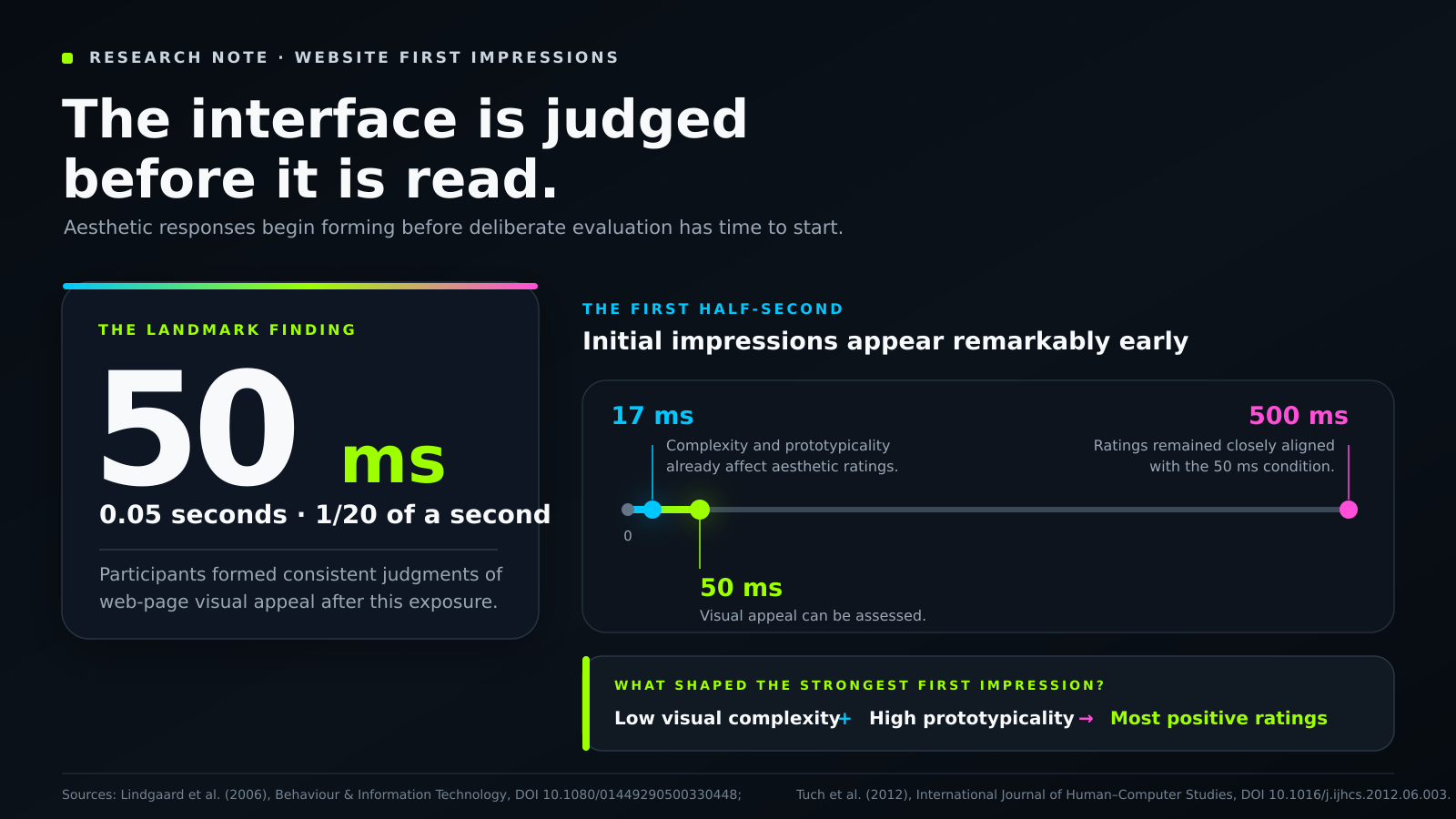
A simple statistical callout introducing the speed at which first impressions can form.
The idea of our “three brains,” briefly and honestly
You may have encountered the popular idea that the human brain is composed of three systems stacked like geological layers. In this model, a primitive “reptilian” brain manages survival, an emotional middle brain centers on structures such as the amygdala, and a newer prefrontal cortex handles rational thought.
It is a memorable image and can be a helpful metaphor, but it is important to recognize that contemporary neuroscience does not treat it as a literal description of how the brain evolved. The “triune brain” model, popularized by Paul MacLean during the mid-20th century, has been substantially revised. The brain did not develop through a series of tidy layers placed on top of one another, and its regions communicate in ways that are far more interconnected than the model suggests.
The metaphor remains useful because the functional distinction beneath it is supported by modern cognitive science. The brain includes systems involved in fast, automatic, and emotional appraisal, as well as systems involved in slower, more effortful, and deliberate thinking. These processes operate on different timescales and place different demands on attention. An interface can make the fast response easier to navigate, or it can immediately create work that deliberate thought must resolve.
Three research findings help make this distinction more concrete.
1. The fast brain responds to an interface before the slow brain reads it
In a landmark study, Gitte Lindgaard and her colleagues showed participants web pages for as little as 50 milliseconds. That is one-twentieth of a second, far too little time to read the content or reason carefully about the design. Even within that brief exposure, participants formed consistent judgments about visual appeal. The finding inspired the paper’s memorable title: designers have approximately 50 milliseconds to make a positive first impression.
Later research examined how quickly these responses can emerge and found that aesthetic judgments may begin forming in even shorter periods. The important point is not that everyone reaches a complete or permanent verdict within a few milliseconds. It is that visual structure produces an immediate response before the user has had time to study the interface deliberately.
These early judgments are not entirely random. Research repeatedly identifies two influential characteristics: visual complexity and prototypicality. Prototypicality refers to how closely a design resembles what people expect that type of website or application to look like. Across the studies, designs with lower visual complexity and higher prototypicality tend to receive more positive first impressions, with visual complexity often playing the stronger role.
This gives us a useful design insight: lower visual complexity can support a positive first impression before deliberate thought has fully entered the process. A dense interface may be intended to feel exciting, but it can initially communicate effort. A clearer interface allows the fast appraisal system to recognize the structure and understand where attention belongs.
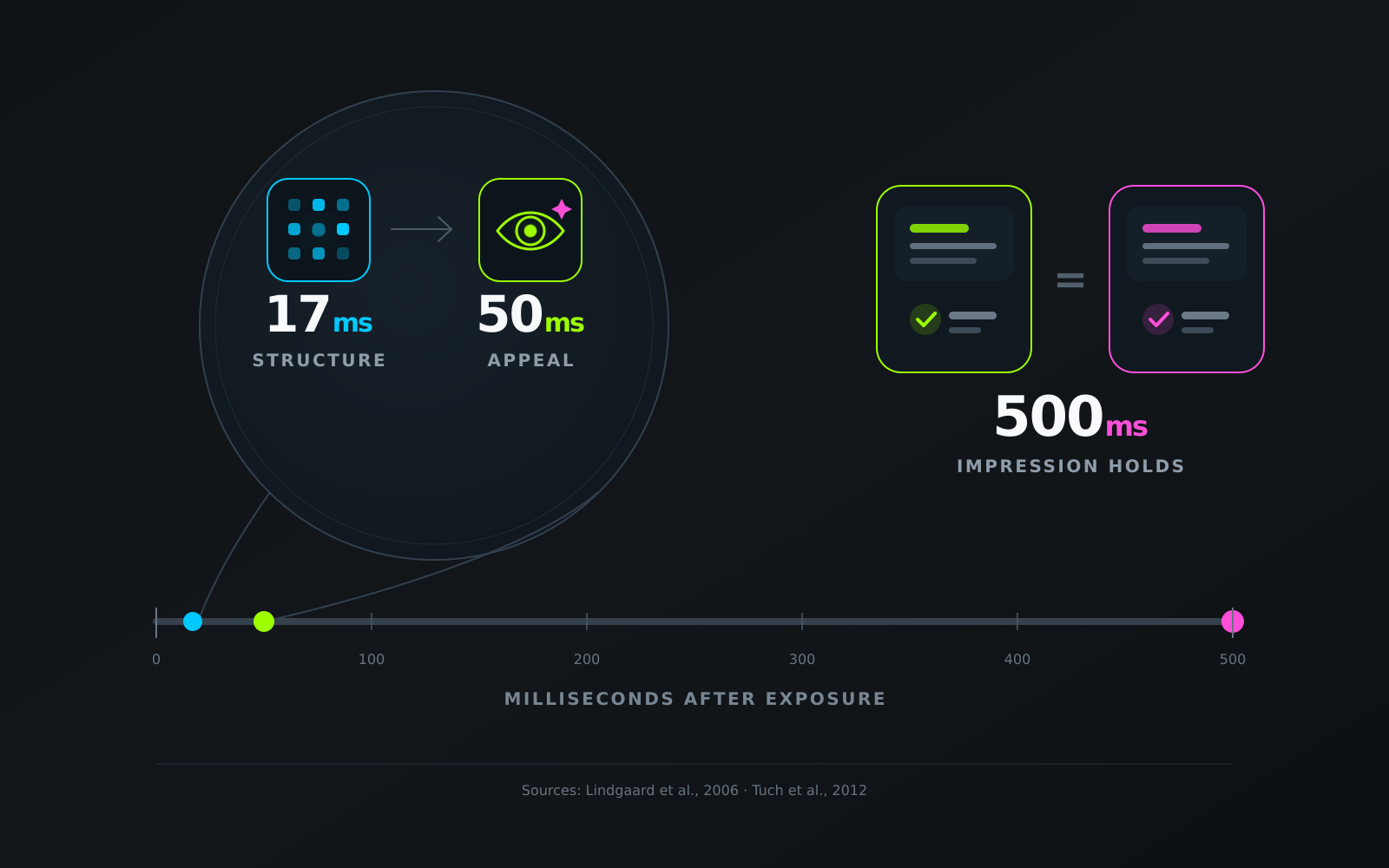
A timeline from 17ms to 500ms showing how quickly initial impressions can begin to form.
2. The reward system is already receiving plenty of stimulation
This is where the emotional and reward-related systems of the brain become relevant. Stimulation can feel familiar to younger users partly because many digital environments have repeatedly reinforced patterns of anticipation and response.
Social platforms provide feedback through likes, comments, messages, and notifications, often on an unpredictable schedule. Uncertainty is important because the brain’s reward system does not respond only when a reward arrives. It also responds to anticipation and to differences between the reward that was expected and the outcome that actually occurred.
This idea appears in Wolfram Schultz’s research on reward prediction error. It also connects with a foundational finding from behavioral psychology: variable-ratio reinforcement, in which rewards arrive on an unpredictable schedule, can produce highly persistent behavior. When likes and notifications appear at irregular intervals, checking the platform becomes connected to the possibility that something rewarding may be waiting.
Neuroimaging research provides additional context. In Lauren Sherman’s studies on the “power of the like,” receiving likes on personal photographs activated the striatum in adolescent participants. The striatum is an important part of the brain’s reward circuitry and is involved in a range of reward and appetite-related responses.
The design lesson is not that every product should imitate these mechanisms. In many cases, the more responsible conclusion is the opposite. First, most products are competing for attention with platforms that have been carefully optimized to encourage repeated checking. Trying to create an even more stimulating interface is unlikely to be a sustainable strategy. Second, a young person may arrive at another product with their attention already divided and their reward system accustomed to frequent prompts.
Adding more movement, density, and interruption may not make the experience more engaging. It may simply increase the amount of information the user has to process. A calm interface can offer something valuable precisely because the surrounding digital environment is already so active.
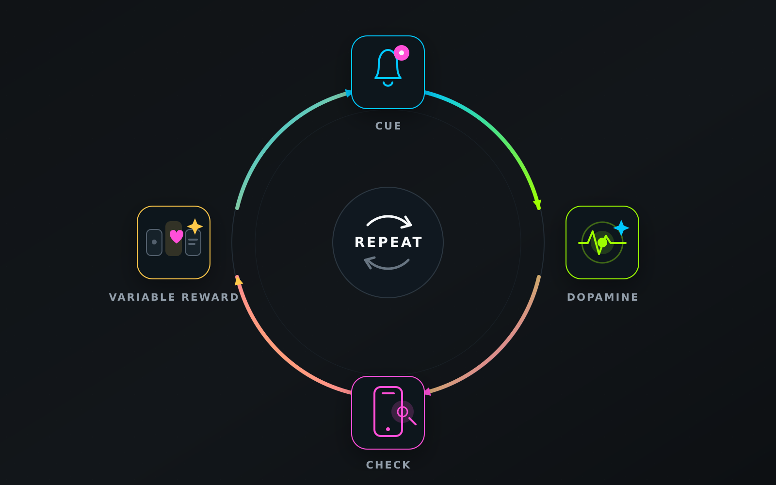
The anticipation and reward loop: cue → dopamine response → check → variable reward → repeat.
3. The brain’s “control tower” is still developing
The third part of the picture is developmental. The prefrontal cortex supports deliberate decision-making, planning, impulse regulation, and the ability to remain focused on a goal. It is also among the last regions of the brain to reach full structural maturity, with development continuing into the twenties.
This is relevant when designing for a Gen Z audience because many members of that generation are still within this developmental period. The systems involved in resisting distraction, regulating impulses, and remaining with an effortful task continue to strengthen throughout adolescence and early adulthood.
This does not mean that younger users are incapable of focus or thoughtful decision-making. It means that an interface should not make concentration unnecessarily difficult. When a screen continuously introduces competing movement, alerts, choices, and reward cues, it places additional demands on the systems responsible for maintaining attention.
Clarity can therefore be understood as more than an aesthetic preference. It is a way of reducing the number of distractions a person must actively resist. The design principle that follows is straightforward: help the fast response succeed so the slower, deliberate system does not have to continually repair the experience. Reduce what must be processed, interpreted, and ignored. That is one of the most important functions of a clear interface.
Why clarity can feel more contemporary than clutter
The fast appraisal system often responds well to simplicity, and deliberate thought benefits from it for a different reason: working memory has a limited capacity.
George Miller’s classic estimate suggested that working memory could hold approximately seven items, plus or minus two. Later research proposed that the practical capacity may be closer to four meaningful chunks. The precise number varies with the task and the way information is organized, but the broader point remains consistent: working memory is limited.
Every competing element on a screen uses part of that capacity. Cognitive Load Theory, developed by John Sweller, gives us a useful framework for understanding this effect. When an interface introduces extraneous load, such as unnecessary decoration, redundant options, or several competing focal points that do not support the current task, less cognitive capacity remains available for the user’s actual goal.
Clutter is therefore more than a matter of visual taste. It creates additional work. The user must decide what deserves attention, what can be ignored, and how the different elements relate before they can begin the task they came to complete.
This is one reason minimal interfaces can feel contemporary rather than empty. What people often experience as “modern” design is partly a sense of fluency, meaning the ease with which something can be perceived and understood. In the processing-fluency account of aesthetic pleasure developed by Reber, Schwarz, and Winkielman, stimuli that are easier to process are often experienced as more pleasant.
A clean layout is not the absence of design. It is evidence that the designer has organized complexity on the user’s behalf. The product still contains the necessary information, but the interface presents it in a sequence and hierarchy that require less effort to understand.
Processing fluency can also contribute to trust, which is essential for most digital products. HCI research on the aesthetics-usability effect, first documented by Noam Tractinsky and his colleagues, suggests that attractive interfaces are often perceived as easier to use. Users may also respond more generously to minor usability problems when the overall experience feels coherent and polished.
Research on visual appeal distinguishes between classical aesthetics, associated with order, clarity, and symmetry, and expressive aesthetics, associated with creativity, richness, and originality. Both can contribute to an experience, but the clarity-oriented dimension is especially relevant to perceptions of usability, credibility, and trust.
For a product team, the useful sequence is this: a clear interface can feel easier to use, an interface that feels usable can become easier to trust, and trust can help a younger user feel comfortable signing up, continuing a task, or returning later.
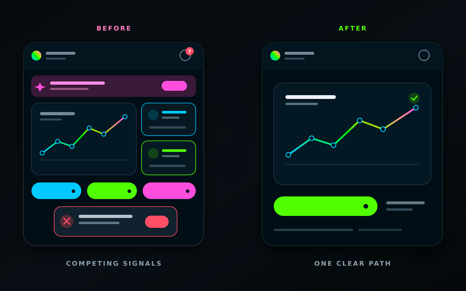
A before-and-after comparison showing how the same interface changes when extraneous load is removed.
Playfulness without density: where the fun can live
A central misunderstanding behind the idea that “young means noisy” is the assumption that playfulness depends on visual density. Following this logic, an interface becomes more playful when it contains more color, more movement, and more decorative elements.
Playfulness can come from somewhere else. It can emerge through feedback, tone, and interaction. A product can feel warm, responsive, and full of personality while keeping each individual screen calm. Delight does not need to occupy the entire surface. It can appear through the way the interface responds to what the user does.
Three design levers can carry much of that personality:
- Feedback. A satisfying tap response, a smooth state change, a subtle sound, or a carefully timed haptic signal can acknowledge that an action has been completed. This creates a reward connected to meaningful progress rather than ambient stimulation. Microinteractions can give a product personality while adding very little cognitive load.
- Tone. Copy can sound like a thoughtful person rather than an administrative form. Empty states, error messages, instructions, and confirmations are opportunities for the product’s character to appear. Warm and considerate language can make an interface feel more human without adding visual complexity.
- Interaction and motion. Motion can explain where an element came from, what changed, and where the user’s action led. When animation clarifies cause and effect, it can reduce cognitive load. When it is included only for spectacle, it may add distraction. A useful principle is to animate meaning rather than decoration.
The practical reframing is simple: playfulness can be added as a thoughtful layer over a calm foundation. Begin with a clear and quiet structure. Then allow feedback, language, and purposeful motion to bring the experience to life.
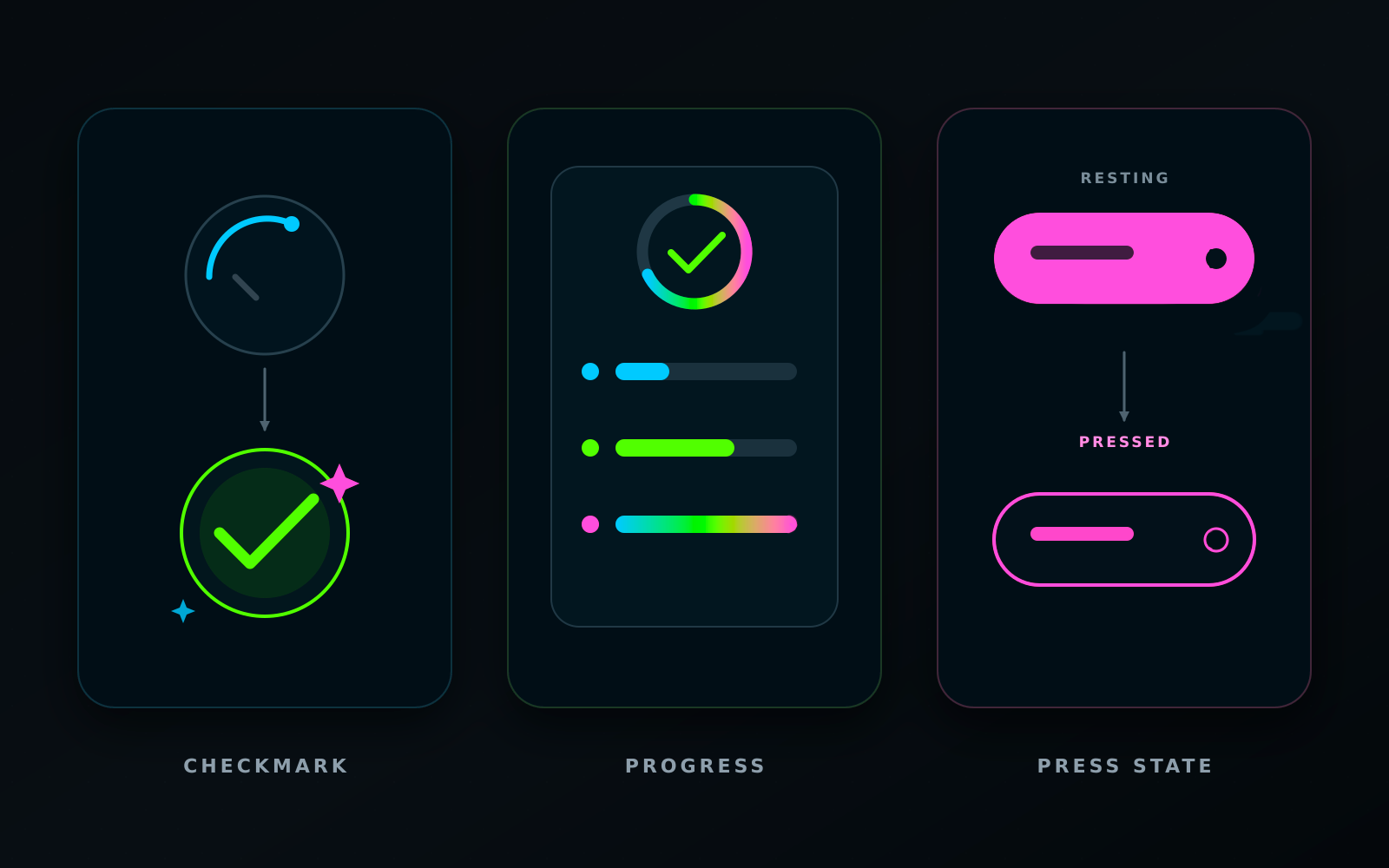
Examples of delight without density: an animated checkmark, responsive progress feedback, and a clear button press state.
What Duolingo, Uber, and Zalando do well
Three products that reach large numbers of younger users demonstrate this principle in different categories.
Duolingo is a particularly useful example because it has a highly playful personality while keeping its core learning screens remarkably focused. The product includes a memorable cast of characters, streaks, celebratory animations, and a famously persistent owl. Yet an individual lesson screen is usually restrained: one question, large legible text, a small number of tap targets, generous space, and one obvious action.
Much of Duolingo’s playfulness appears through feedback and tone, including sounds, character reactions, progress acknowledgements, and conversational writing. The underlying learning surface remains calm. The product shows that fun and clarity do not have to compete. Personality can live in the response while the task itself remains easy to understand.
Uber demonstrates the value of reduction. Its central task, requesting a ride, is organized around a map, a destination field, and a small number of confirmation steps. For users who expect a mobile task to be completed quickly, this restraint becomes part of the product’s value. Elements that are not relevant to the current decision are kept outside the immediate path.
The interface feels contemporary partly because it does not ask the user to understand everything at once. It reveals the information needed for each stage of the task and keeps the next action visible.
Zalando applies a similar discipline in a commercial environment, where the pressure to display promotions, messages, categories, and incentives can be especially high. The product-browsing experience relies on a clear grid, strong photography, and restrained typography. The products provide much of the visual energy, while the interface helps users explore without competing with the content.
The shared pattern is simple: the content can carry energy while the interface provides calm structure. Across these products, younger users encounter personality through imagery, feedback, and voice rather than through an unnecessarily dense interface.
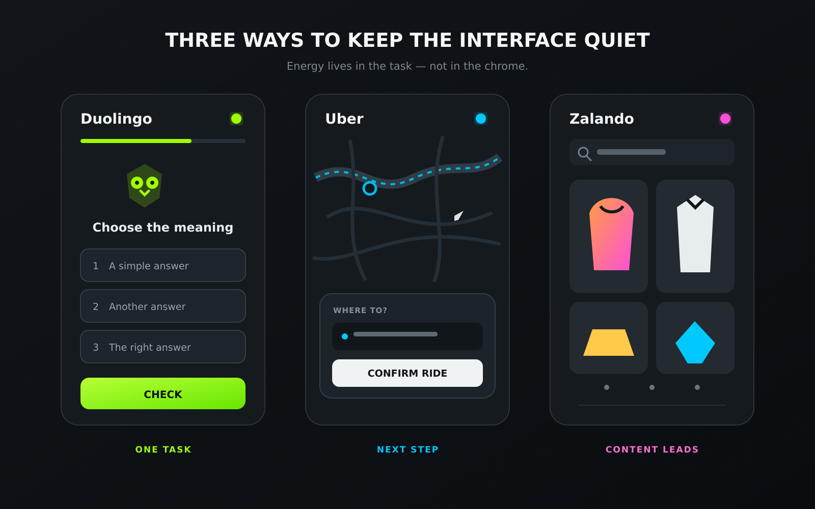
Duolingo, Uber, and Zalando: one clear action, content carrying the energy, and a quiet interface supporting the task.
A practical framework: designing for the fast response
If you take one practical method from this article, let it be this checklist. Each principle connects to one of the mechanisms discussed above.
- Support the first 50 milliseconds. Keep the initial visual complexity low and use a layout that feels recognizable. Novel structure introduces additional learning. Place originality in the content, imagery, and voice rather than making users rediscover where navigation or primary actions are located.
- Give each screen one primary job. Support working memory by making the central action obvious. If the team cannot describe the main purpose of a screen in one sentence, the user may also struggle to identify it.
- Remove extraneous load rather than useful information. Reducing clutter does not mean reducing meaning. It means removing elements that do not support the current task so the important information can receive appropriate attention.
- Place playfulness in the feedback. Use microinteractions, sound, haptics, purposeful motion, and human language to create personality. These elements can make the experience feel lively without filling the screen with competing decoration.
- Connect rewards to progress rather than anxiety. Let moments of delight acknowledge something the user has accomplished. Avoid relying on ambient, unpredictable stimulation that encourages checking without helping the person move toward a meaningful goal.
- Design with developing attention-regulation systems in mind. Do not make focus depend entirely on willpower. Reduce unnecessary distractions and make the clearest path the easiest one to follow.
- Treat clarity as part of your trust strategy. A clear interface can feel more usable, a usable interface can feel more trustworthy, and trust helps people feel comfortable continuing, returning, and taking meaningful action.
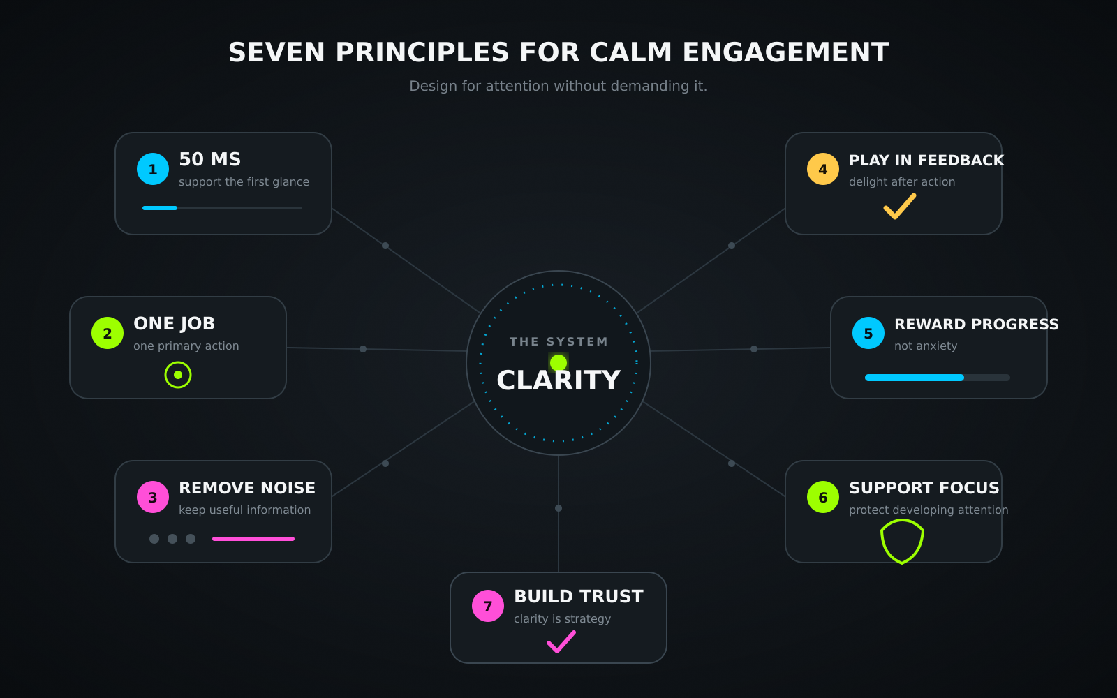
A clear, shareable summary of the seven design principles.
The takeaway
A generation surrounded by unprecedented levels of digital stimulation may not need every product to provide more of the same. Visual complexity can be interpreted as effort within the first fraction of a second. Reward systems are already receiving frequent prompts from platforms designed to encourage repeated checking. For many younger users, the systems involved in attention regulation and impulse control are also continuing to develop.
Designing for this reality does not mean creating something dull or without personality. It means creating something clear, then allowing personality to emerge through feedback, tone, content, and purposeful motion rather than through constant density.
Clarity is not the absence of relevance for younger audiences. In an environment filled with competing signals, clarity can become one of the qualities that makes an experience feel especially thoughtful, contemporary, and welcoming.
Designing for a generation surrounded by stimulation may require more clarity, not more stimulation.
References
The sources below provide the research discussed throughout the article. Where a study is behind a paywall, the DOI links to the official record and may also provide access to an author copy.
- Lindgaard, G., Fernandes, G., Dudek, C., & Brown, J. (2006). Attention web designers: You have 50 milliseconds to make a good first impression! Behaviour & Information Technology, 25(2), 115-126. doi.org/10.1080/01449290500330448
- Reinecke, K., Yeh, T., Miratrix, L., Mardiko, R., Zhao, Y., Liu, J., & Gajos, K. Z. (2013). Predicting users’ first impressions of website aesthetics. CHI ’13, 2049-2058. doi.org/10.1145/2470654.2481281
- Tuch, A. N., et al. Google Research. The role of visual complexity and prototypicality regarding first impression of websites. research.google
- Miller, G. A. (1956). The magical number seven, plus or minus two. Psychological Review, 63(2), 81-97. doi.org/10.1037/h0043158
- Sweller, J. (1988). Cognitive load during problem solving. Cognitive Science, 12(2), 257-285. doi.org/10.1207/s15516709cog1202_4
- Reber, R., Schwarz, N., & Winkielman, P. (2004). Processing fluency and aesthetic pleasure. Personality and Social Psychology Review, 8(4), 364-382. doi.org/10.1207/s15327957pspr0804_3
- Tractinsky, N., Katz, A. S., & Ikar, D. (2000). What is beautiful is usable. Interacting with Computers, 13(2), 127-145. doi.org/10.1016/S0953-5438(00)00031-X
- Tuch, A. N., Roth, S. P., Hornbæk, K., Opwis, K., & Bargas-Avila, J. A. (2012). Is beautiful really usable? Computers in Human Behavior, 28(5), 1596-1607. doi.org/10.1016/j.chb.2012.03.024
- Kim, S., et al. (2023). Cognitive abilities and visual complexity impact first impressions in five-second testing. Behaviour & Information Technology. tandfonline.com
- Schultz, W. (1998). Predictive reward signal of dopamine neurons. Journal of Neurophysiology, 80(1), 1-27. doi.org/10.1152/jn.1998.80.1.1
- Schultz, W. (2016). Dopamine reward prediction error coding. Dialogues in Clinical Neuroscience, 18(1), 23-32. doi.org/10.31887/DCNS.2016.18.1/wschultz
- Sherman, L. E., Payton, A. A., Hernandez, L. M., Greenfield, P. M., & Dapretto, M. (2016). The power of the like in adolescence. Psychological Science, 27(7), 1027-1035. doi.org/10.1177/0956797616645673
- Ferster, C. B., & Skinner, B. F. (1957). Schedules of reinforcement. Appleton-Century-Crofts. doi.org/10.1037/10627-000
- Montag, C., et al. (2025). The emotional reinforcement mechanism of and phased intervention strategies for social media addiction. PMC. pmc.ncbi.nlm.nih.gov
- Arain, M., Haque, M., Johal, L., Mathur, P., Nel, W., Rais, A., Sandhu, R., & Sharma, S. (2013). Maturation of the adolescent brain. Neuropsychiatric Disease and Treatment, 9, 449-461. doi.org/10.2147/NDT.S39776
- Casey, B. J., Jones, R. M., & Hare, T. A. (2008). The adolescent brain. Annals of the New York Academy of Sciences, 1124, 111-126. doi.org/10.1196/annals.1440.010