
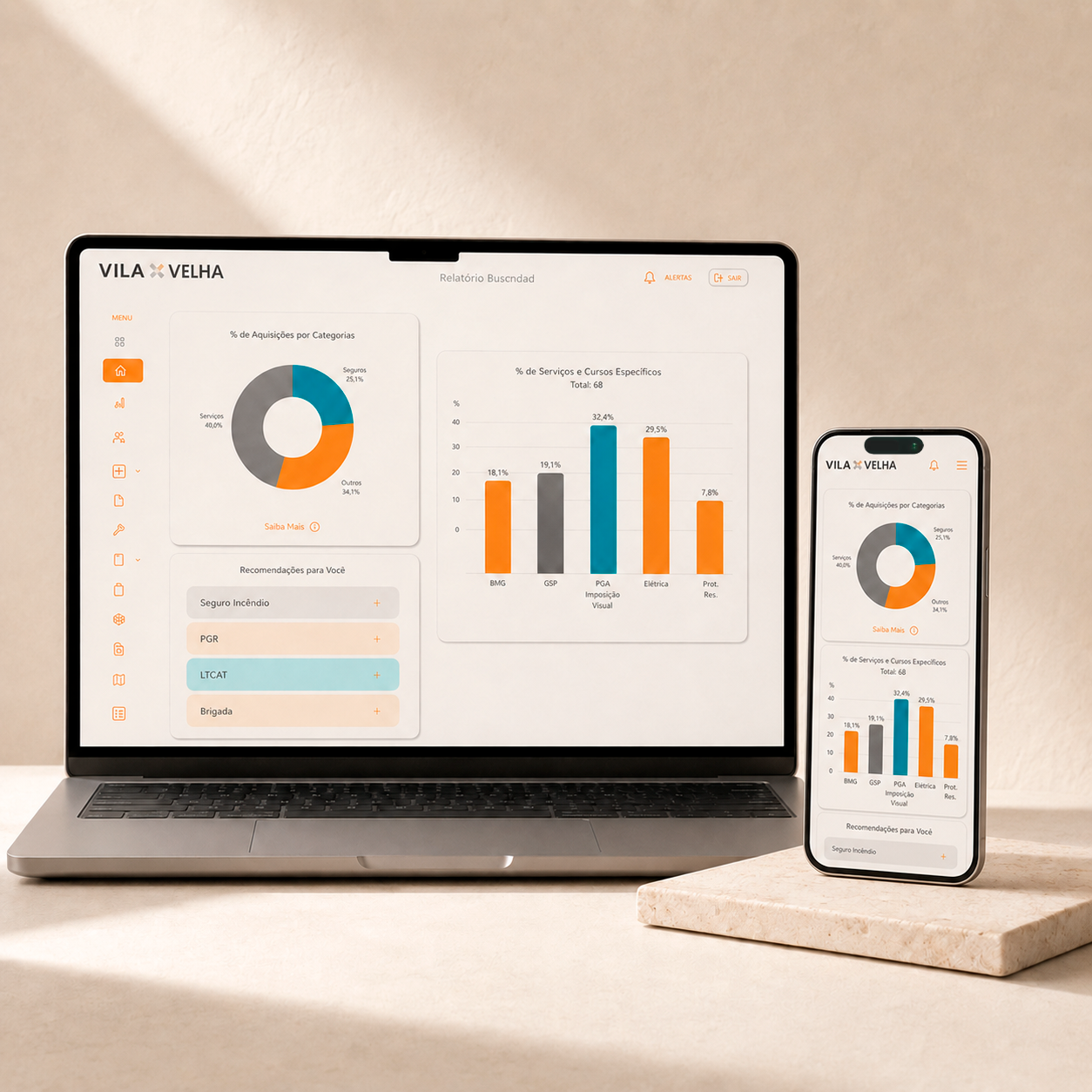
The situation
Vila Velha is a B2B insurance broker connecting businesses with coverage across health, real estate, life, and other specialized insurance areas. Its extranet supports the day-to-day relationship between the company, its agents, brokers, and partner organizations. It is where users manage documents, follow policies, and complete recurring operational tasks.
The challenge extended beyond the visual interface. As the extranet had evolved, new screens, filters, and actions had been added to accommodate different requirements. Over time, this created a system with more elements but less clarity about which ones were still useful and how information should be organized.
The project therefore began with a broader question: which parts of the extranet continued to support real workflows, and which could be simplified or reconsidered?
Where we focused
Rather than beginning with interface changes, the review started with structured interviews involving ten platform users from different roles and insurance areas. The objective was to understand how the extranet was used in practice before deciding how it should change.
The interviews explored:
- Actual usage. Which features appeared in daily work, which were used occasionally, and which were rarely needed.
- Sources of friction. The screens, filters, and flows that required additional time or made users less certain about what to do next.
- Unmet needs. The workarounds people had developed when the existing system did not fully support their tasks.
- Access context. How desktop and mobile usage differed and where responsive behavior was most important.
- Mental models. How agents and brokers expected policies, documents, and insurance information to be grouped and labeled.
More than 60% of the interface elements evaluated were rarely or never used by the participants interviewed. This indicated that the strongest starting point was not adding more functionality, but creating a clearer structure around the tasks that remained important.
"The research showed how interface density and information architecture were affecting the speed and confidence with which users completed routine tasks."
What we prioritized
The findings were organized into three design priorities:
- Reduce and clarify. Remove or deprioritize elements that interviews showed were rarely used, while organizing important functions according to users’ existing mental models.
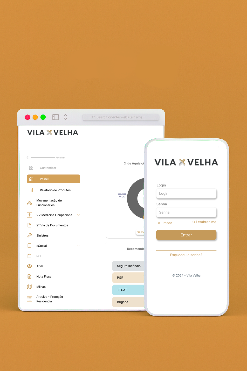
- Responsive by default. Design the five desktop and five mobile screens as one connected system, accounting for the different contexts in which the extranet is accessed.
- Consistency and credibility. Create a modern, coherent interface in which navigation, feedback, and visual patterns behave predictably across different tasks.
The interview synthesis also informed three user archetypes: the high-frequency operator, the occasional user, and the supervisor who needs a broader view of activity. Each design priority was considered across all three patterns of use.
How the research shaped the redesign
The document upload flow was one of the most frequent and important tasks identified during research. The previous process included unnecessary steps and provided limited status feedback, making it a useful test case for the new navigation and interaction model.
The redesigned flow reduces the number of steps, makes progress visible, and communicates the status of uploaded documents more clearly. The wider extranet redesign was developed as a modular system in Framer across five desktop and five mobile screens, then prototyped and reviewed with client stakeholders before sign-off.
What changed
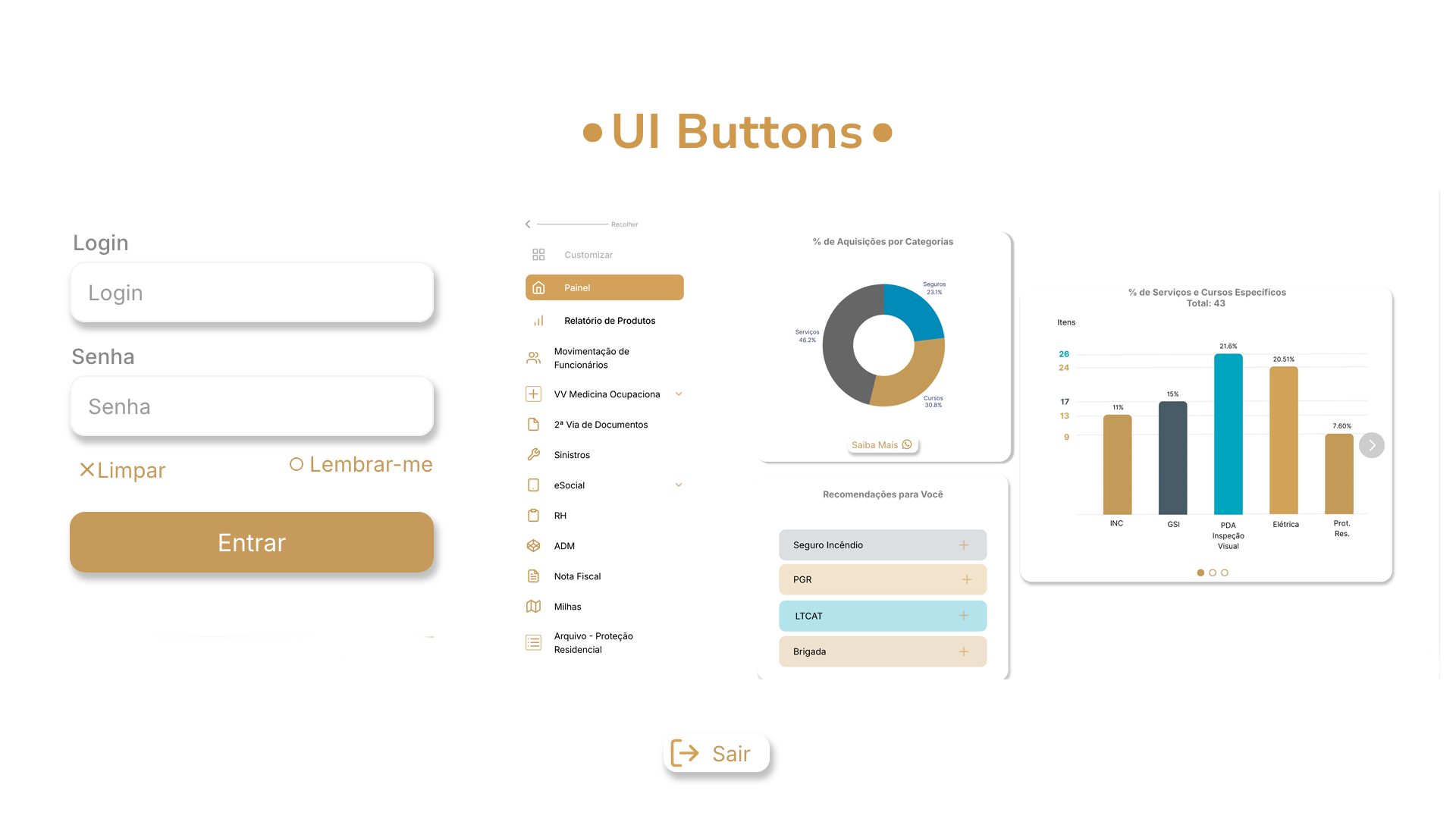
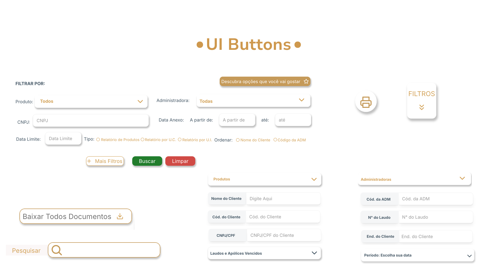
The redesigned navigation reflects the frequency and importance of users’ actual tasks. The document upload flow provides clearer progress and status information, while responsive layouts allow the same core workflows to remain accessible across desktop and mobile.
Because the interface was created as a modular system, future screens can reuse the same navigation, components, and feedback patterns. This gives the extranet a clearer foundation for continued development without requiring its underlying structure to be reconsidered with every addition.